
The Project
My Role:
Interaction Design, Visual design, User Research, Prototyping
Timeline:
July 2026 - September 2026
Overview:
This project was completed as part of a UX/UI professional certificate course.
Gaming is one of those hobbies that just about anyone can get into if they give it a try.
Approximately 40-45% of the world's population at some point or another will pick up a video game. Whether you're a young newbie or an older pro, you'll likely be able to find something that appeals to you on the market.
However, It can be difficult for some gamers to find the equipment they need. There might be time or location constraints to how and when they can shop, or they might need additional guidance on what products will work best for their gaming setups.
The Goal
Create an easy, quick and informative shopping experience for users of all gaming experience types, whether they are starting on easy mode, hard mode, or hold-on-to-your-hats mode. Ultimately, it was important to give these users a one-stop spot to find whatever they might need, one that didn't overwhelm users with unrelated products and one that gave the freedom to easily compare products, specs and pricing, allowing users to make educated purchases.
The Design Process


In the process of transitioning from paper to digital wireframes, I realized that there were missing pieces. There were steps that needed to be added to create a more natural user flow, and a couple of the existing screens needed to be adjusted to make everything work better together.
The biggest gap was the lack of a thank-you page at the end of the purchase. Without it, the flow ended too abruptly. Adding that screen helped wrap things up in a way that felt intentional, giving the user a sense of completion.
When it came to the layout adjustments, the shopping cart layout was revisted. Originally I had planned to have this page double as both the cart as well as the order confirmation page, but combining them into one created more confusion than I had intended. I broke these into two separate screens, as well as added the ability for the user to make quantity adjustments to their cart as needed, something that felt essential once it was added in.
Usability
After putting together the low-fidelity prototype, I ran a usability study to get a better sense of how the users themselves felt about the current flow. I wanted to see where people might run into pain points, or if anything in the experience wasn't working the way I expected.

Results

1
The Comparison tool needed streamlining.
Needing to click "compare" only once confused users. The expectation was for two clicks, one for each product that needed to be compared, as well as a "confirmation" window giving a breakdown on the products that were being compared.
3
The app needed to be better optimized for users with visual impairments.
Users with visual impairments might have difficulty using some critical parts of the app due to button and text size.
2
The Shopping Cart experience needed to be updated.
The shopping cart functioned appropriately, but users suggested additional functionality to help them move more seamlessly through the purchasing process (a shopping cart representation on all screens, removal/addition of items in addition to the quantity adjustments.)
4
The user-based experience could be enhanced.
A few users wanted a more personalized experience. While not prioritized, additional pages like a user profile and a past orders page should be added.
Visual Identity
I wanted the visuals to feel bright and bold. The goal was to channel a classic arcade energy, where neon lights, buzzing machines, and a sense of fun all come together into one experience.
The colors needed to feel electric, playful, and a little chaotic in the best way, while the typography needed to have enough range to tread the line between clean and bubbly.

Final Design
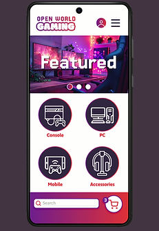
After correcting the issues that came up in the first round of usability testing, a second round of testing was completed. The second round showed a big improvement in how people felt about the updated experience.
Users responded really positively to the new user experience pages, and said that the previous issues had been cleared up, making the flow feel more intuitive overall.


What's next?
While this version of the app and corresponding web page are considered finished for now, I have plans to revisit it and make further improvements to better suit my user’s needs.
1
A better experience for “beginners”.
I plan on incorporating some sort of guidance for users who are new to gaming and unsure what they’re looking for. This may come in the form of pre-selected starter kits for users who don’t know what sort of equipment they might need, or easy-mode tutorials.
3
Product Reviews
Reviews for any sort of purchase are important! They can make or break product choices, especially for knowledgeable shoppers.
This is a must have for future iterations.
2
App specifically - Previously viewed item list.
Since this is something I was able to incorporate on the website, I’d like to make sure the app has the same experience by adding it there as well.
4
User experience tags.
Adding tags to products that say things like “Best for Beginners”, “Casual” or “Competitive Gamers” would help guide users towards the products that better fit their skillsets.